This is a timelapse video of a digital portrait I painted, and eventually sold as a #cryptoprint on MakersPlace.
Even though you can watch every single change made (in fast forward) it can be difficult to understand what’s happening, and why I’m doing it that way.
I’ll explain.
But first, give it a watch 👇
1️⃣ Layout
This is the first part of the video up to second 20 or so. It’s the part that has the least going on, most difficult to see, but it’s the most important.
This is the part of the process that sets the tone for everything that comes later. If you do this step right, you have fewer problems rear their ugly heads.
So What’s Happening?
I’m working from a photo reference shared by the model who specifically intended it to be used as inspiration for art.
(I recommend that source imagery, or even better something that you take yourself. Don’t just randomly search for something and then use it.)
The point is that I have a photo to work with. The image is already defined. The ratios are right there in the source, so all I have to do is put them in the right place within the boundaries of the painting’s edge.
Easier said than done!
When you first start out making portraits it’s nearly impossible to do this right. Eventually you get a feel for “the right corner of the eye should go. . . there! And the outer turn of the nostril should go. . . . there!”
The is why learning to draw is a foundational skill for learning how to paint. You need to be able to get the structure correct first unless you want to undo everything you make at the beginning.
At the end of this stage I have a line drawing of the subject that already looks like them. Time to move to the next phase.
2️⃣Blocking In Color
Now that I have a map of where everything should go, time to put color in the right places.
Do you start with the subject first and then finish the background? Or start with the background and then the subject? A bit of both, going back and forth?
I like starting with the background and clothing first. This helps me get the general color “feel” of the painting moving in the right direction so the skin tones are more likely to land in the right place.
Otherwise you can paint the subject first, paint in the background, and suddenly the subject looks wrong. It’s because all the colors influence each other and one color that looks great next to one color can look awful next to another.
Color theory is weird. 🎨
But starting with the background is a quick and easy way to get a lot of coverage of the space, and gives you a foundation for the subject.
I like blocking in shapes of color first for skin with three colors: base, darks, and lights.
I look for the larger shapes first, and put as many in as I can before looking to add finer detail. If I start with the fine details first I get bogged down and it takes forever with zero progress.
Broad strokes 👉 medium 👉 fine
3️⃣Details
Now that the painting is covered with paint, it’s time to work with the details.
Even though the broad strokes fill in a lot, this stage still takes twice as long as the first two combined.
This stage is where you add in local variations of color. This is often means adding red to the nose and cheeks where the blood vessels are close to the surface.
The eyes are especially important to get right. If you miss the mark with them the whole painting is out of whack.
The nose is tough to get right, too. Especially from this angle. The best way to think about it is not as a feature, but as a group of unique shapes that fit together like a puzzle. This helps you actually see it as it is instead of trying to make it look like the idea of a nose that you unconsciously have stored in your Platonic catalog of “here’s what human features look like.”
The dark hair behind the nose helps to “push” the nose forward in space and the hair functions as a sort of outline to help define the contour of her nose.
And so it goes.
Lay in more details, work on their placement, and blend them together. But don’t blend too much! That can make your image look overworked, and a bad blend job will kill your piece.
When it comes to digital painting I find blending to be the most difficult part. Some of the tools will only push paint around instead of using the surface to mix them together like you can with traditional medium. This is the one place where I wish there were more tactile feedback in the process.
But I digress. Let’s look at how blending fits into the picture (pun intended).
Images are mostly defined by two things:
- The placement of details and
- The transitions between them
A hard edge is a sharp transition. A round surface is a smooth transition between two details.
So the amount that you blend two colors or values together tells your brain what the surface is supposed to look like. Hard line? Clearly defined edge. Transitions? Must be a rounded surface.
Good General Rule: If you have a sharp transition on one side of a shape, you’ll likely have a smooth transition on the other.
And on this process goes until it’s pretty much where I want it.
4️⃣Finishing Touches
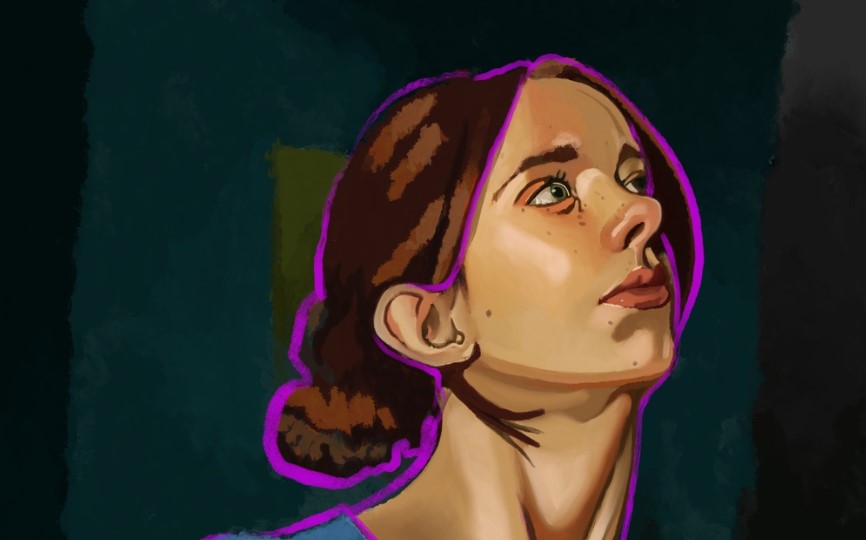
I *love* adding bright color outline accents to my work. If I had to tell you where it comes from I supposed I’d say comic book art influence as a kid, but I really couldn’t tell you for sure.
All I know is I love doing it.
Most of the time I’ll choose an electric version of whatever color is on the opposite side of the color wheel from the dominant hue of the subject.
In this case she is very yellow. Right across the wheel is purple. Easy.
But it’s not a simple outline. There are some fun subtleties to it.
I like to think of it as a heavy light that surrounds her. It gathers near the bottom of the contours due to gravity’s influence. It also will trace the inner contours of the subject to clearly show what is in front of the others.
And in only a few spots you will see it casting color onto her skin.
These tiny details help make the outline feel like it “fits” in this environment. It’s actually interacting with the subject. It’s behaving like a real thing in space more than a flat application of a single width comic strip outline.
Getting this vibe right is often the part of the painting that I have the most fun with.
And now that the electric outline is in place I have spent enough time looking away from the interior of the subject that I can notice that the subject is a bit flat. She lacks volume.
The real finishing touches will be the final highlights that just touch her skin and give it the glow that tells you there’s light somewhere in this dark world.